Project Three Photos
Photography Advanced
Project Three
Tessa Georgoulakos


First and foremost, I wanted to concentrate on my subject for this photograph. I didn't like how the photo concentrated on the plant rather than her, so I had to sharpen it first by duplicating the backdrop layer. I used the Filter > Sharpen > Unsharp Mask setting after changing the layer's blending mode to Luminosity. I saw a holiday card I liked and decided to recreate it. I grabbed the text Bernier for my card and used these colors as my palette.
Summary Statement:
When I shot these photos, I didn't see that the one I loved most had my subject blurred. As a result, I intended to start by altering in Photoshop. I wasn't sure if I could sharpen my subject's image at first, but I'm pleased with how much better it appears now.


I wanted to give another Christmas mood with this image and add a watercolor effect to it. I utilized the font Bernier once more, this time placing it beneath the watercolor layer to make it appear transparent. I used the water color brushes from the download and used the color picker to get the red and white shades from the photos. Even though I only used a few layers for this one, I think it turned out well.
Summary Statement:
I like how the splashes of white and red appear around the cup, and how the lettering complements the colors. I feel like I have a lot of photos and could have chosen a better one, but I just wanted to have some fun with this one.


.I downloaded the watercolor brushes and selected this photograph that I felt would complement it nicely. I used my brushes to apply the colors from the photos. For this one, I experimented with a few different brushes and used large brushes for the sky. With this, I added a couple layers to the original. One layer has an Overlay setting, while the other has a Darken setting.
Summary Statement:
In the sky, I believe this one looks pretty great. However, I'm not fond of how the ground appears. I'd like to do some more experimenting with the image. It would be interesting to delete the edges and paint over them with watercolor. Overall, it was enjoyable learning how to download and use various brushes.


I tried to create another HDR image using multiple photographs and going to (File > Automate > HDR Pro and choosing Merge to HDR Pro. I changed the image to 32-bit and then removed ghosts. I then toned/adjusted the image as needed.
Summary Statement:
I am not sure if this is how it should come out. The ground looks very dark and it doesn't look HDR as I wanted.


After enabling lens correction on the photo, I created a layer mask for my daughter and myself. I modified the entire photograph by first adjusting the brightness, color balance, hue/saturation, vibrance, sharpness, and others. I fixed the color tone of the image. I used the dodge tool on my face with the layer mask on to decrease the redness.
Summary Statement:
I enjoyed using several tools to lighten the face, such as the dodge tool. This one, I believe, did not require as much work to seem different from the original. I think there may be a few more tweaks, but I enjoy how the finished result turned out.

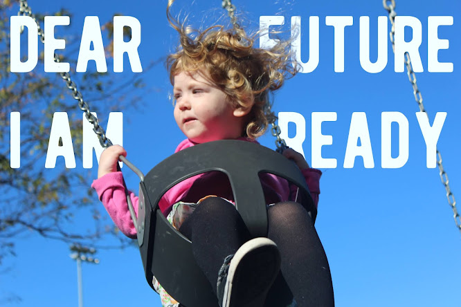
I chose and modified the subject using the layer mask, making sure to do the hair. The wording behind my subject is the initial layer, or bottom layer. To make this graphic, I used two video examples to learn the tools needed. I didn't touch up the original shot because I liked the color and thought it was great as is. With this one, I just wanted to play around with the text and layer mask tools.
Summary Statement:
I'm incredibly pleased with how this one turned out, and I can't wait to make more like it. If I had to redo this, I would move the phrases and put "FUTURE" beneath "DEAR" and "I AM" above "READY." I can see how this could be misread, so maybe the other way is preferable.


This one was easier for me to do than the last one. Maybe because I already knew how to make it. I selected File > Automate > Photomerge and checked off "Blend Images Together" and Photoshop was able to sew the images together. To complete my panorama I merged the layers together and then trimmed them.
This is another panoramic I did while came out really cool. I loved how the clouds looked in this one so I had to ty and make a panoramic of the docks. It was easier for me to do than last time and I had a lot less trimming to do for this one. Overall I'm happy with how it came out and I would like to make more of these in the future so I can keep improving.
Comments
Post a Comment